When it comes to email marketing, you probably spend most of your time thinking about the message you want to get across. You’re likely to focus your energy on crafting the perfect copy, as well as including compelling images.
Don’t let your attention to the body of the email come at the expense of important structural elements, like footers, though. Email footers may not be the first thing you think of when creating emails to send to your subscribers, but they’re an essential piece of the puzzle.
The footer won’t get the attention of your readers before they open the email, but it may be their last impression—especially if your readers are considering unsubscribing. A good email footer should include legal elements, tell your readers how to get in touch, and double down on your branding. A great one can unexpectedly delight your audience and invite more interaction.
Read on for instructions and examples to help you design an email footer that will strengthen your brand and improve your customers’ experience.
What is an email footer?
The footer of your email is located at the very end of your email. It comes after all the body content, including your email signature. It may be as basic as your company’s address and an unsubscribe link, or it might have useful details like contact information, social links, or legal disclaimers.
If you haven’t planned and standardized your email footer, it’s past time to do so. You’ll save valuable time when you no longer have to think about where and how to include basic details with each new email message. Plus, customers expect robust email footers, and making one that hits the mark will prevent frustration with your brand.
What should I put in my email footer?
Email footers are a great place for including information required by spam and privacy laws. They’re also a good place to connect with your readers. Here are the elements you should consider including.
Legally required footer elements
Your business must include certain information in your footer to stay on the right side of the CAN-SPAM Act, the GDPR, and other laws that protect consumer rights. No matter what, make sure you always include:
If industry regulations require you to include legal disclaimers, your footer is a great place to put them. You may also want to include a copyright notice, though you don’t have to do so for your email to have copyright protection.
Optional (but useful) footer elements
Along with the legalities, you can use your footer as a hub for reader interactions. Footers are the best place to put utility items like:
- Social media buttons and a website link: In case your readers need help or just want to learn more, give them a place to go that isn’t email.
- A subscription reminder: Tell consumers when and how they signed up for your list to preempt untrue accusations of spam.
- CTAs: Build your list and audience by including a referral link or a suggestion to forward the email to someone who might like it.
- A view-in-browser link: If your message isn’t displaying well in someone’s email client, they can follow this link to view it as an HTML web page.
- A safelist request: Ask readers to add you to their address book to stay out of spam folders and improve your overall deliverability.
- Company branding: Your company name, logo or wordmark, tagline, and other brand assets can make the footer recognizably yours.
Examples of custom email footers and what we love about them
Email footers may be a standardized medium, but that doesn’t mean you should settle for being like everyone else. Personalize whatever elements you choose to include in a way that’s true to your brand. Here are five great customized email footers to inspire you.
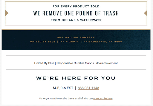
1. Highlight your company values like United by Blue.
Lifestyle company United by Blue does a great job of communicating what they stand for. The company sells outdoor gear that’s durable and reliable, which they state in their footer. They also appeal to their audience of nature lovers by sharing how they’re involved in taking care of the planet.
Customers know where to go for help, thanks to the prominence of United by Blue’s phone number and hours of business. Everything is organized and easy to find, and they have their hashtag, so you can find the company on social media.
Takeaway: Include relevant information for customers, such as valuable contact information and brand positioning that reminds them why they’re a fan.
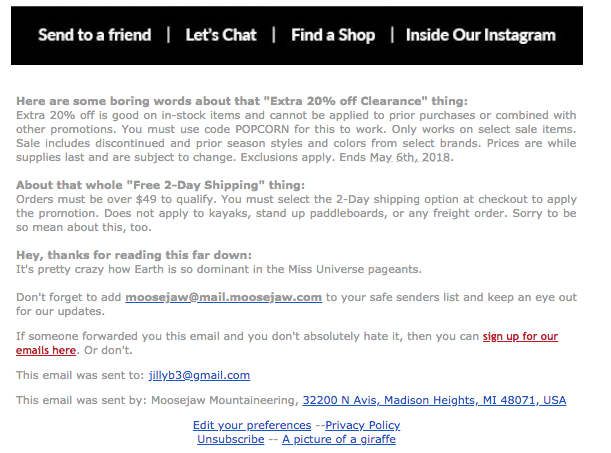
2. Share your business personality like Moosejaw.
Moosejaw keeps their disclaimers lively by including subheads that let their company’s fun (and sarcastic/irreverent) voice shine. They even thank subscribers afterward for making it that far down in the email.
Their footer includes a link to their privacy policies, a link to an email preference center, and an easy-to-find unsubscribe link. Plus, the link to a picture of a giraffe does, in fact, go to a picture of a giraffe.
Takeaway: Comply with the law, but don’t be afraid to make disclaimers your own.
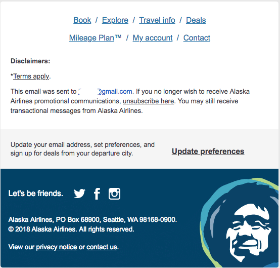
3. Add brand imagery like Alaska Airlines.
Alaska Airlines makes their email footers stand out by sticking to their branding. They don’t include their wordmark, but anyone who’s flown with them will recognize the image that features on their aircraft’s tails. They also have a fun way of asking their subscribers to follow them on social media.
Takeaway: Using your brand assets and voice is a great way to make your email footer feel unique.
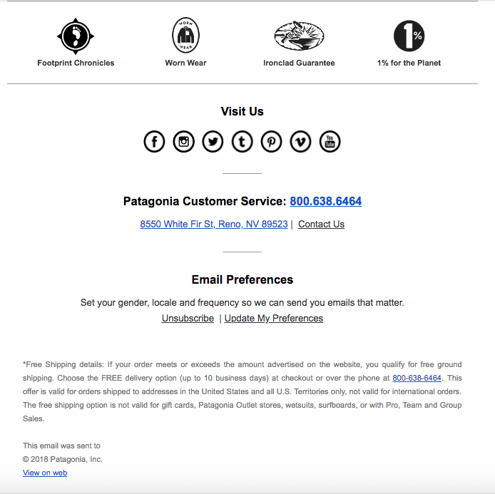
4. Include an email preference link like Patagonia.
Patagonia shows they respect their subscribers by linking to their email preferences center with a promise that their emails will be more relevant for those who share their information. They also remind readers what’s so great about Patagonia by including links to a few of their community-oriented programs.
Takeaway: Having a link to your email preference center in your footer is a great way to give your readers control over how you communicate with them.
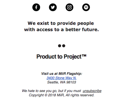
5. Share your company mission like MiiR.
MiiR makes their company’s mission a big part of their footer to remind subscribers who they are and what they stand for. They also have all the required information, but they’ve made their unsubscribe message friendly and nice.
Takeaway: Strengthen your brand by making your company’s objective clear in your email footer.
Email footers are just one part of a great message
These email footer examples and tips can help you get started with crafting a high-performing email. Take that knowledge further with our advice on creating compelling copy and optimized headers, footers, and CTAs for email campaigns that are sure to perform.
Try out Campaign Monitor today to play with our range of flexible options for editing your footers – you can choose a layout; customize text color, font, and size; add a logo; add hyperlinks; customize the background color, and more.


